
For years, enterprise software and B2B platforms were defined by a singular, blinding aesthetic: endless seas of white space, stark clinical borders, and harsh blue hyperlinks. It was functional, but it rarely felt inspiring.
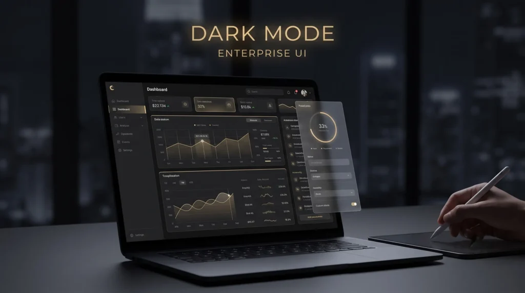
Today, the landscape is shifting. Leading technology partners and SaaS platforms are increasingly adopting deep, high-contrast dark modes—often paired with subtle glassmorphism and vibrant accent colors.
But this transition isn’t just a passing design trend. It is a calculated evolution in user experience (UX) and conversion psychology. Here is why dark mode has become the definitive aesthetic for modern digital engineering.
1. Reduced Cognitive Load and Eye Strain
Enterprise users don’t just briefly scroll through business systems; they live in them. Whether it is an operations manager monitoring an analytics dashboard or an engineer deploying cloud architecture, prolonged exposure to bright, white-heavy screens accelerates visual fatigue.
Dark mode flips this dynamic. By utilizing deep blacks and elevated dark grays (like #121212 for content cards), the interface dramatically reduces blue light emission and screen glare. This allows users to sustain focus for longer periods without the associated headaches or eye strain.
2. The Psychology of Luxury and Authority
Color communicates trust before a user ever reads a single headline. In color psychology, black represents power, sophistication, and authority.
When a company pairs a stark black background with a highly intentional accent color—such as a luxurious gold or a vibrant neon—it instantly distances the brand from commodity software providers.
- The Contrast Effect: A dark canvas allows key elements (like an animated data counter or a primary Call-to-Action button) to command absolute attention.
- Perceived Value: Users inherently associate dark, sleek interfaces with premium, high-tier technology. It signals that the platform is modern, secure, and built for serious execution.
3. Elevating Data Visualization
If your platform relies heavily on data, analytics, or complex AI reporting, dark mode offers a massive structural advantage.
Bright colors, graphs, and heatmaps often get lost against a white background. On a dark canvas, these same elements pop with incredible clarity. By leveraging micro-interactions—such as a subtle glowing drop-shadow when a user hovers over a metric card—designers can guide the user’s eye exactly where it needs to go, making complex data sets feel digestible and intuitive.
4. Depth Through Glassmorphism
The challenge with dark mode is preventing the interface from feeling flat or heavy. This is where modern CSS techniques like glassmorphism come into play.
By applying semi-transparent, blurred backgrounds to sticky navigation bars or overlapping mega menus, designers introduce a sense of depth and hierarchy. It creates a frosted-glass effect that allows the underlying dark canvas to subtly bleed through. This not only softens the UI but creates a highly tactile, futuristic feel that perfectly aligns with AI-native products.
The Takeaway
Design is no longer just about looking pretty; it is about reducing operational friction. As software becomes more complex and AI automations handle heavier workloads, the interfaces we use to interact with these systems must become calmer, more focused, and more deliberate.
By embracing dark mode, high-contrast typography, and purposeful micro-interactions, companies aren’t just modernizing their brand—they are actively improving the daily lives of the people who rely on their software.